The presenter’s face appeared warm and flattering on the LED screen behind them, but the practical lighting hitting them directly made their skin look pale and unflattering. This color temperature mismatch created visual discord that audiences sensed even if they couldn’t articulate the problem. Understanding how to use color temperature correctly enables lighting designers to create cohesive environments where all visual elements work together harmoniously.
Color Temperature Fundamentals
Color temperature measures light’s warmth or coolness on the Kelvin scale. Lower values (around 2700-3200K) produce warm, yellowish light reminiscent of incandescent bulbs. Higher values (5600-6500K) produce cool, bluish light similar to daylight. This range affects how people and objects appear—warm light flatters skin tones and creates inviting atmospheres; cool light feels energetic and modern but can make people appear pale or unflattering without careful management.
Cameras interpret color temperature through white balance settings. A camera balanced for 3200K tungsten light renders tungsten-lit scenes neutrally; the same camera setting under 5600K daylight produces blue-shifted imagery. Mixed color temperatures within a single scene create images where some elements appear warm while others appear cool—a problem when the mix wasn’t intentional. Broadcast and recording applications demand particular attention to color temperature consistency because cameras reveal discrepancies that in-person viewing forgives.
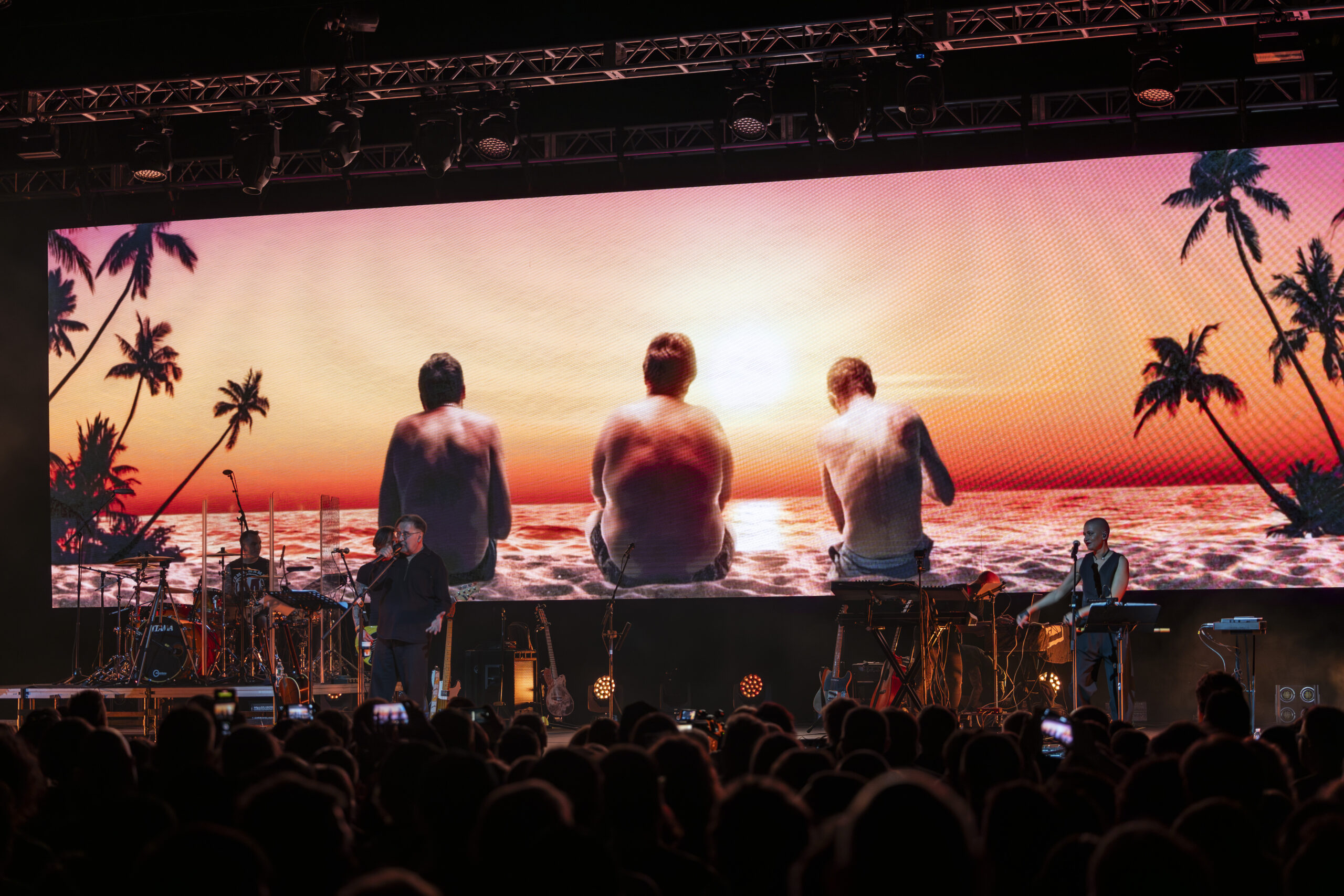
Matching LED Walls and Practical Lighting
LED walls displaying content operate at specific color temperatures, typically calibrated to D65 (6500K) as a standard reference. Lighting hitting presenters in front of these walls must complement this temperature for visual cohesion. Using 3200K tungsten on presenters while the LED wall behind them displays 6500K content creates the mismatch that makes presenters look warm (or the wall look cool) depending on camera white balance. The solution: either adjust LED wall color temperature to match lighting, or use lighting fixtures that match wall temperature.
Tunable LED fixtures from manufacturers like ETC, Chauvet, and ARRI enable precise color temperature matching. The ETC ColorSource series and ARRI SkyPanel provide continuous tunability from warm tungsten to cool daylight, enabling exact matching to any LED wall setting. This flexibility proves essential for productions where different segments might require different looks—morning keynotes might use cooler temperatures for energy, while evening galas shift warmer for intimacy.
Intentional Color Temperature Contrast
While matching often serves productions well, intentional contrast creates specific effects. Cool LED content behind warm-lit presenters creates visual separation that emphasizes the human element. Warm environments on screen behind cool-lit products can make those products appear cutting-edge and modern. These contrasts must be chosen deliberately rather than occurring accidentally—understanding color temperature enables designers to create these effects intentionally rather than discovering them problematically.
Measurement tools verify actual color temperature rather than relying on fixture specifications alone. The Sekonic C-800 spectrophotometer and Astera Box provide accurate readings that reveal what fixtures actually produce versus what labels claim. Variations between fixtures of the same model, effects of dimming on color temperature, and differences between LED wall areas all become visible through measurement. Professional productions measure rather than assume, ensuring color temperature decisions reflect actual conditions.
Color temperature mastery separates professional lighting from amateur attempts. The knowledge to match temperatures when cohesion serves the production, contrast them when separation enhances storytelling, and measure actual conditions rather than assuming specification accuracy enables lighting that supports events rather than distracting from them. This invisible craft becomes visible only when done poorly—the highest compliment for color temperature work is that nobody notices anything wrong.